October 19, 2026
Field notes: the parcel that looked grid-adjacent until we traced the corridor
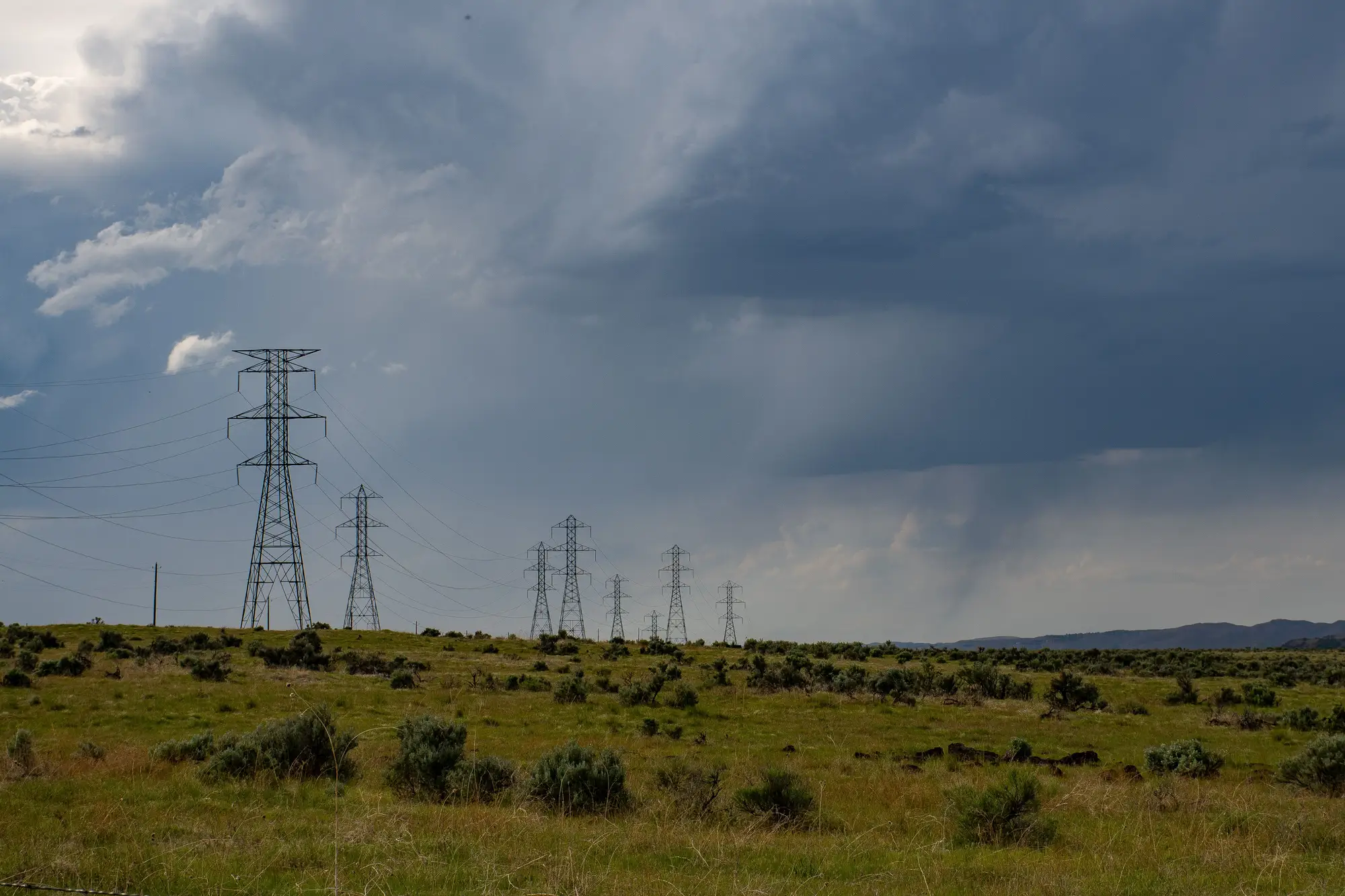
A developer sent us a parcel last spring that looked like a gift. Eleven hundred acres, good solar resource, and a 230 kV substation sitting 1.1 miles away on the map. Someone on the team had drawn a straight line from the parcel centroid to the substation fence line, called it the interconnection distance, and built a pro forma around it.
We get a version of this parcel every month. It's not a knock on whoever drew the line. A desktop GIS extract gives you a distance, and a distance feels like information. But a straight line doesn't know there's a reservoir between the parcel and the substation, or that the only buildable corridor has to thread a state highway crossing, a rail spur, and about four hundred feet of wetland that nobody delineated before the screening call.
That's what was sitting between this parcel and that substation.
What the straight line missed
The reservoir forced the corridor north, around the shoreline setback. The highway crossing needed a permitted span, which meant the route had to hit the crossing at close to a right angle instead of cutting diagonally, adding a dogleg. The rail spur ruled out one approach entirely because the railroad's own ROW ran parallel to the only flat ground for half a mile. And the wetland, once we traced the actual hydrology rather than the NWI polygon everyone defaults to, pushed the line another few hundred yards east.
By the time we laid an actual route over the imagery, the plausible corridor ran 4.6 miles. Not 1.1. The interconnection cost estimate that had been built on the short number was off by a factor that matters a lot more at the financing stage than at the screening stage, which is exactly the wrong time to find out.
Why this keeps happening
A lot of the analysts we talk to will tell you up front that a straight-line distance is a simplification. The trouble is that it's a simplification that looks precise. It comes out of the GIS to two decimal places, it sits next to the acreage and the slope figures in the same spreadsheet row, and it gets treated with the same confidence as everything else in that row. Nobody circles it in red and writes "guess" next to it, even though that's closer to what it is.
Utility GIS extracts don't fully solve this either. They tell you where the substation and the line sit today, which is useful, but they don't tell you where a corridor could actually run between your parcel and that line once terrain, existing ROW, water crossings, and land cover get accounted for. That's a routing question, not a lookup.
What changed the call
Once the 4.6-mile corridor was in front of them, the developer didn't drop the site. They re-ran the interconnection cost assumption, adjusted the land price they were willing to offer, and kept the parcel in the portfolio at a number that reflected the real route instead of the optimistic one. That's a better outcome than finding this out during due diligence, or worse, after an LOI.
This is the whole case for mapping the corridor before the site goes into a pro forma rather than after. Grid Proximity Mapping builds that corridor and distance layer from current satellite imagery, substation by substation, so the number in your screening spreadsheet is a routed distance instead of a ruler measurement.
Next time a parcel looks grid-adjacent on the desktop map, trace the corridor before you trust the number.